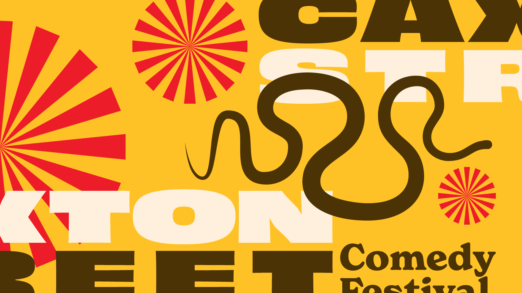
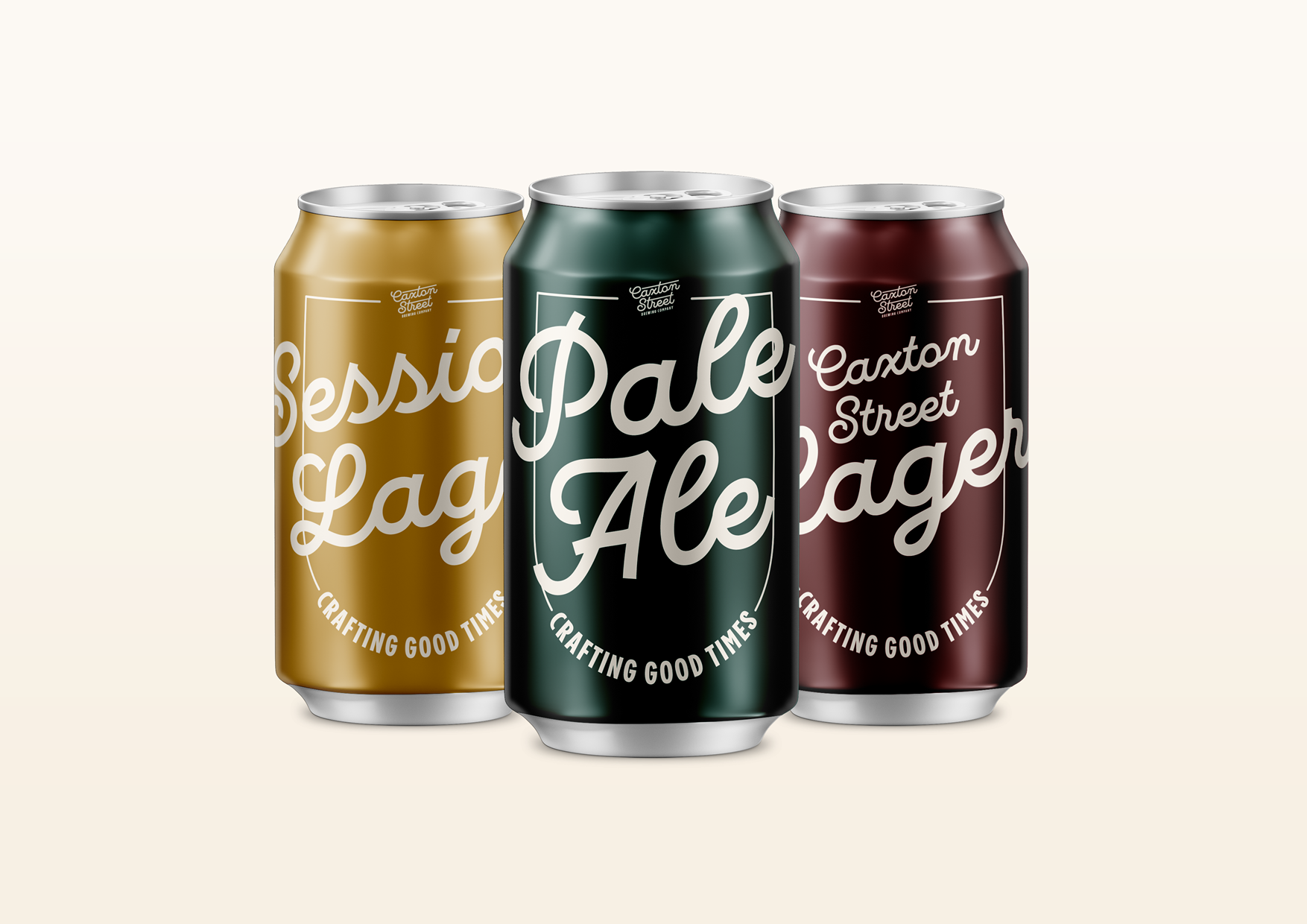
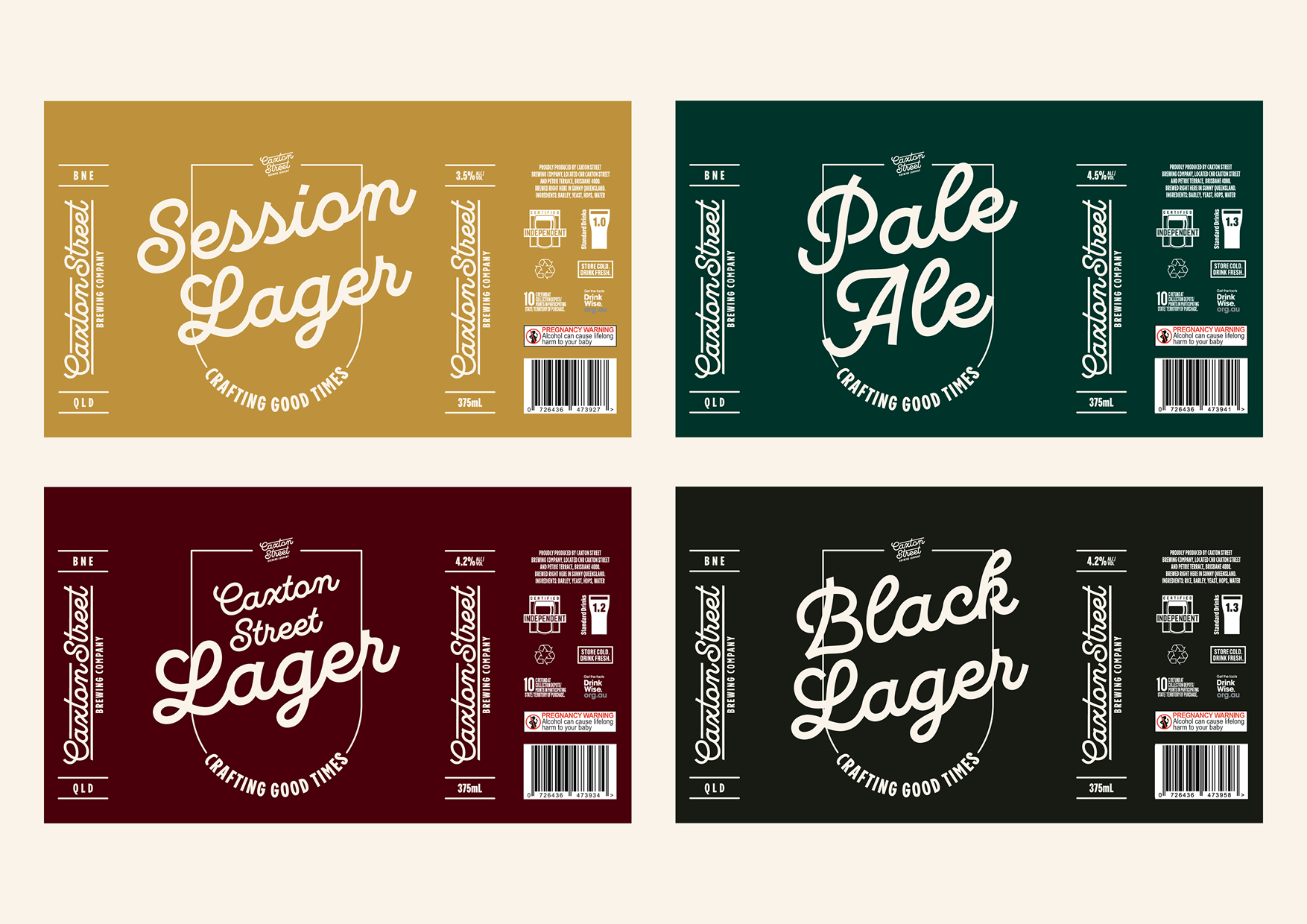
As part of their recent expansion into retail cans, Brisbane-based craft beer brewery Caxton Street Brewing Company contracted me to develop designs their core range of cans while also refining and upgrading their brand identity.
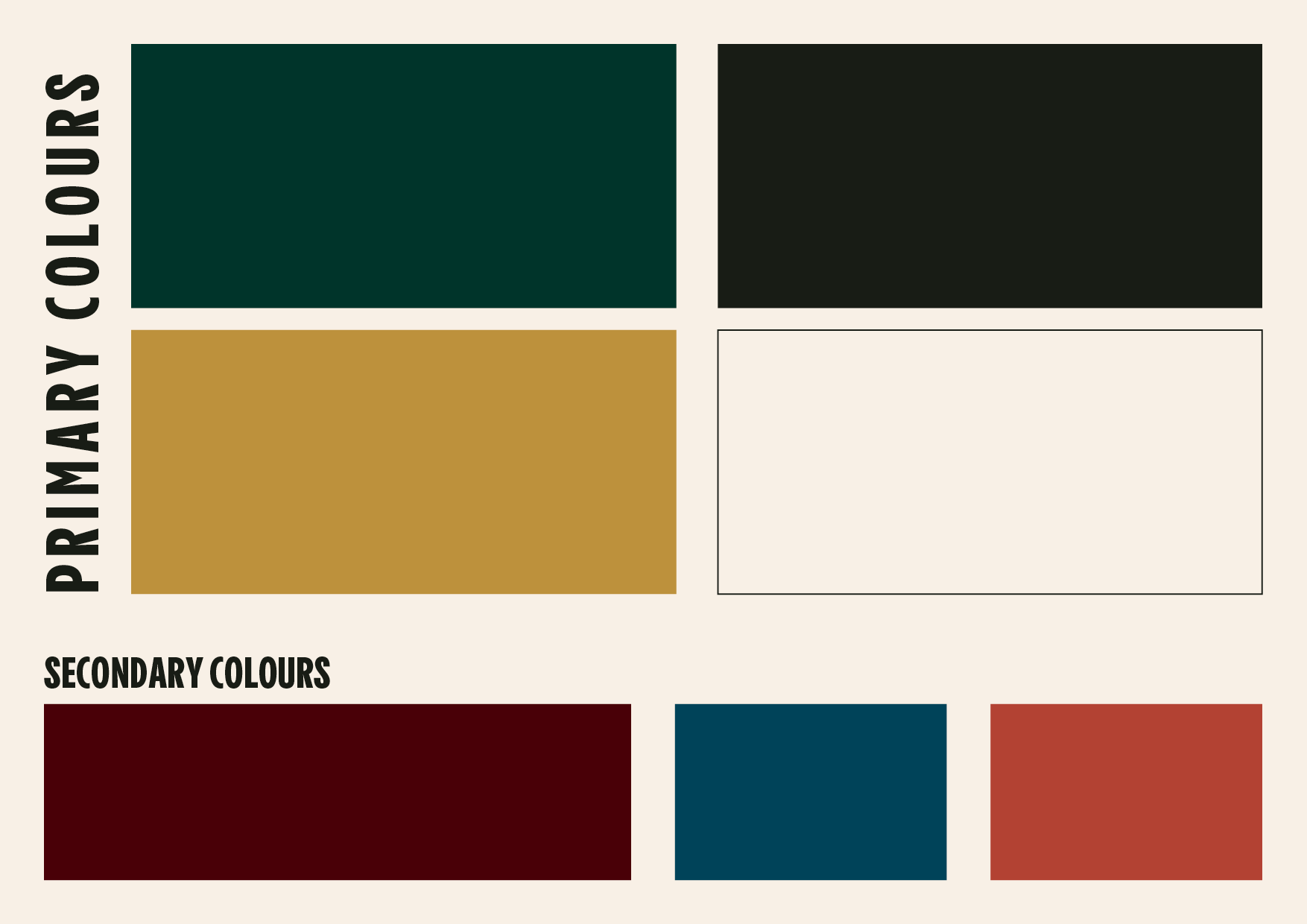
The process of designing the cans helped to inform the overall approach to the brand identity, and as the project progressed, purpose and intention was revealed, helping to crystalise the various brand elements. Working on the packaging and identity in tandem proved to be a very holistic approach for this emerging brand.
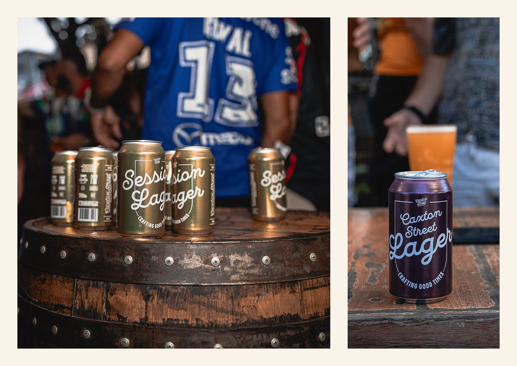
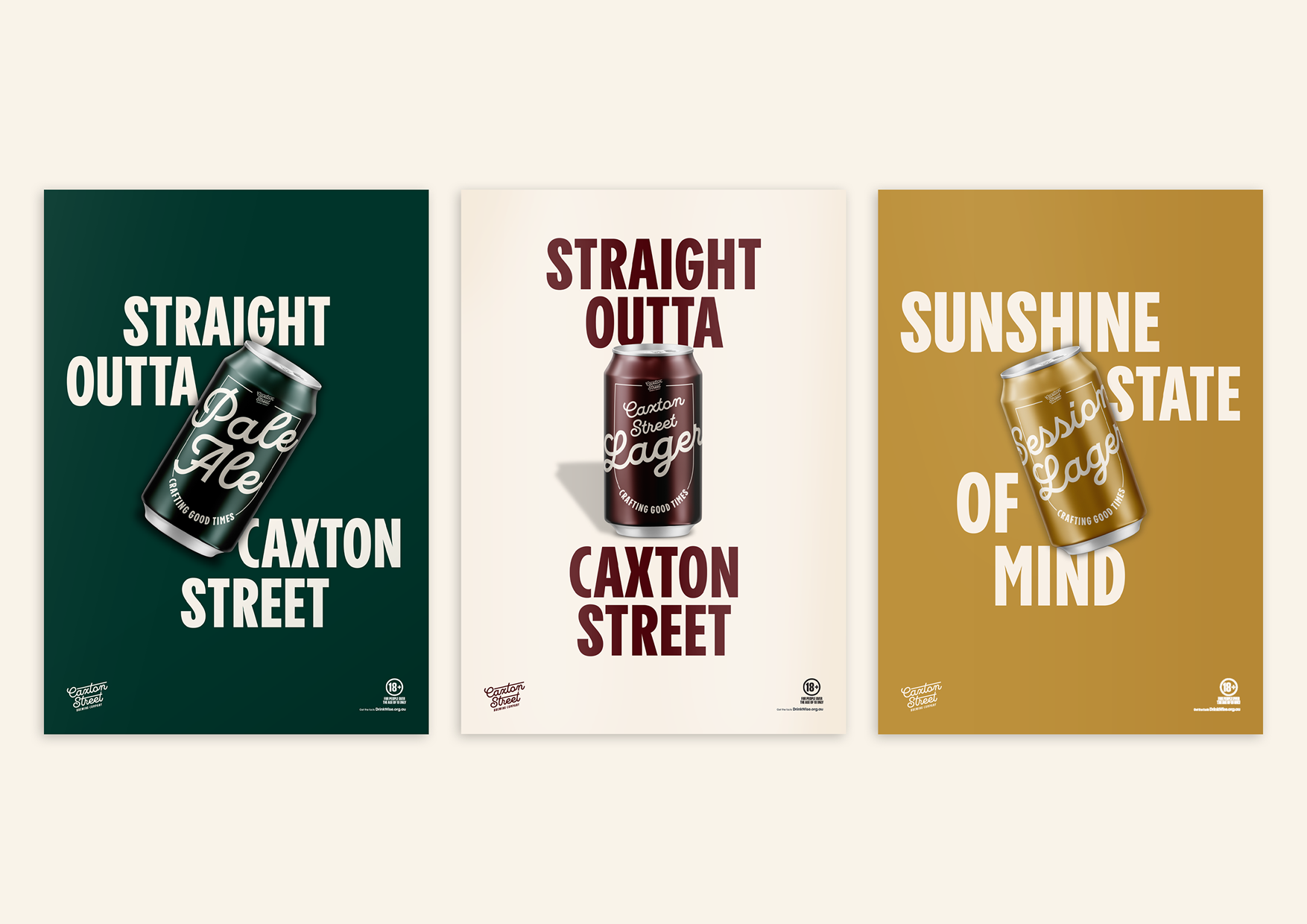
In this project you can also see promotional collateral I designed for the cans.
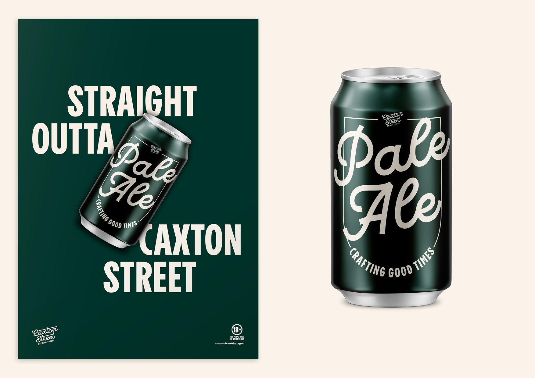
The owners wanted to feature the cans with typographic posters, emphasising the identity of each beer through colour.
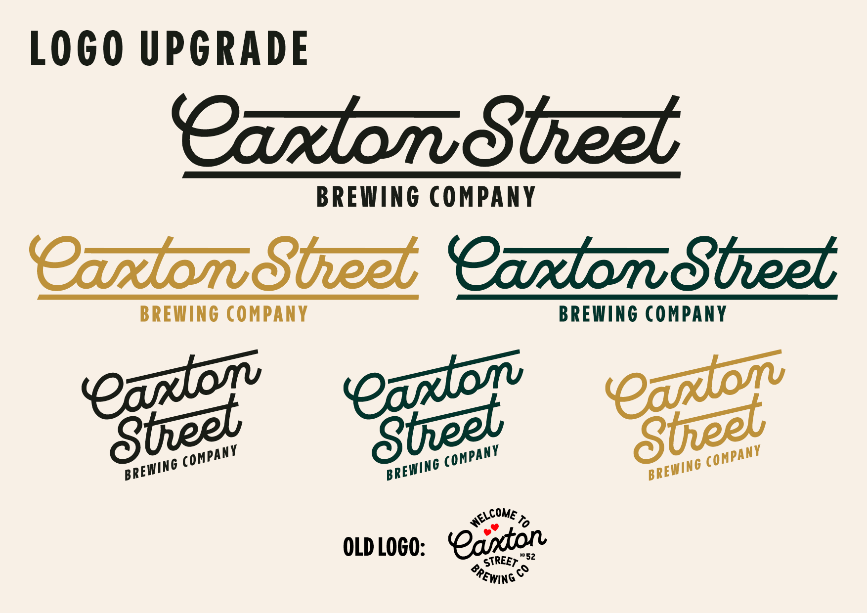
It was important to the owners to stay true to the ideas present in the original logo. They felt that there was more potential within their existing identity. Therefore they didn't want a complete re-brand, or even a "new" logo. What we settled on we referred to as a "brand upgrade" - a refined logo that helped to focus the rest of their core brand identity.